
ENTERPRISE DESign system:
component Library & Brand theming
A multi-brand theming model enables a single, shared component system to deliver best-in-class, consumer-centric UX at scale. Design tokens control typography, palette, and spacing to express each brand’s visual identity, while a validated UX foundation ensures intuitive, consistent experiences across the platform.
COmponent Library
We built an enterprise component library of over 100 reusable components to enable creative teams to scale across a multi-brand platform.
Grounded in validated UX patterns, the library removes friction, reduces redundant work, and accelerates delivery—freeing creative teams to focus on craft, storytelling, and brand expression without sacrificing consistency or quality.
Enterprise
themING
The enterprise theme provides a visual foundation for the Enterprise Design System, surfacing all design tokens and components in a single, cohesive view. This enables teams to easily review, govern, and update core design decisions.
Enterprise
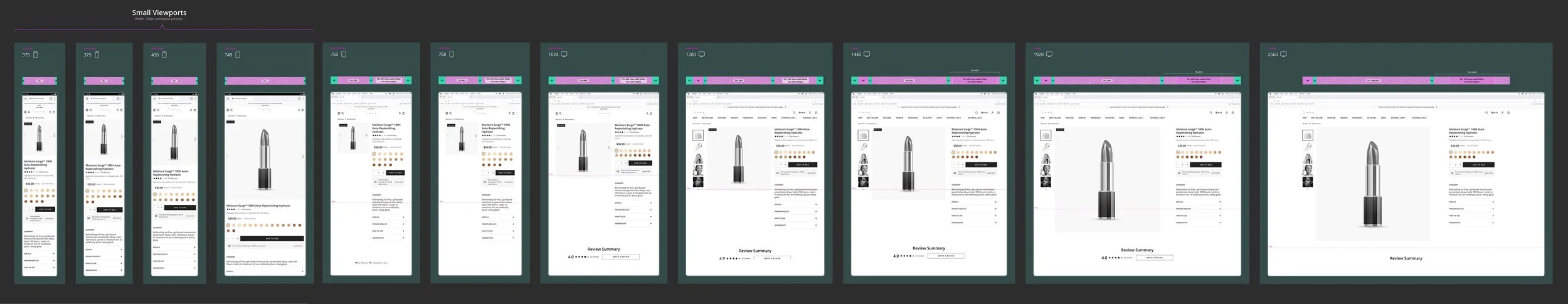
toKEN / COMPonent Responsiveness
The screen responsiveness defines how the tokens / components adapt across screen sizes—mobile vs desktop. It outlines breakpoint logic, component behavior, and content scaling rules.
M•A•C COSMETICS
BRAND THEME APPLIED
This visual illustrates the enterprise PLP wireframe before and after brand theming is applied, demonstrating how the shared UX foundation adapts to a brand’s visual identity—highlighted here with MAC Cosmetics.